Seagull. Connecting the Global Supply Chain.
Client
Seagull
Sector
Logistics
Expertise
Brand Strategy
Visual Identity
Application Design
Brand Guidelines
Seagull is an industrial chartering firm that brokers the supply chain of iron ore mining to global buyers. Their expertise lies in managing the transportation and logistics of iron ore, ensuring that it gets delivered from the mine to the buyer efficiently and reliably.
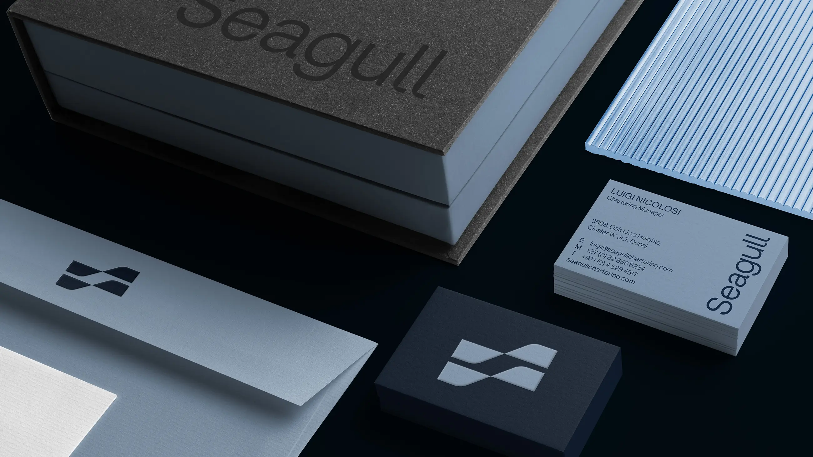
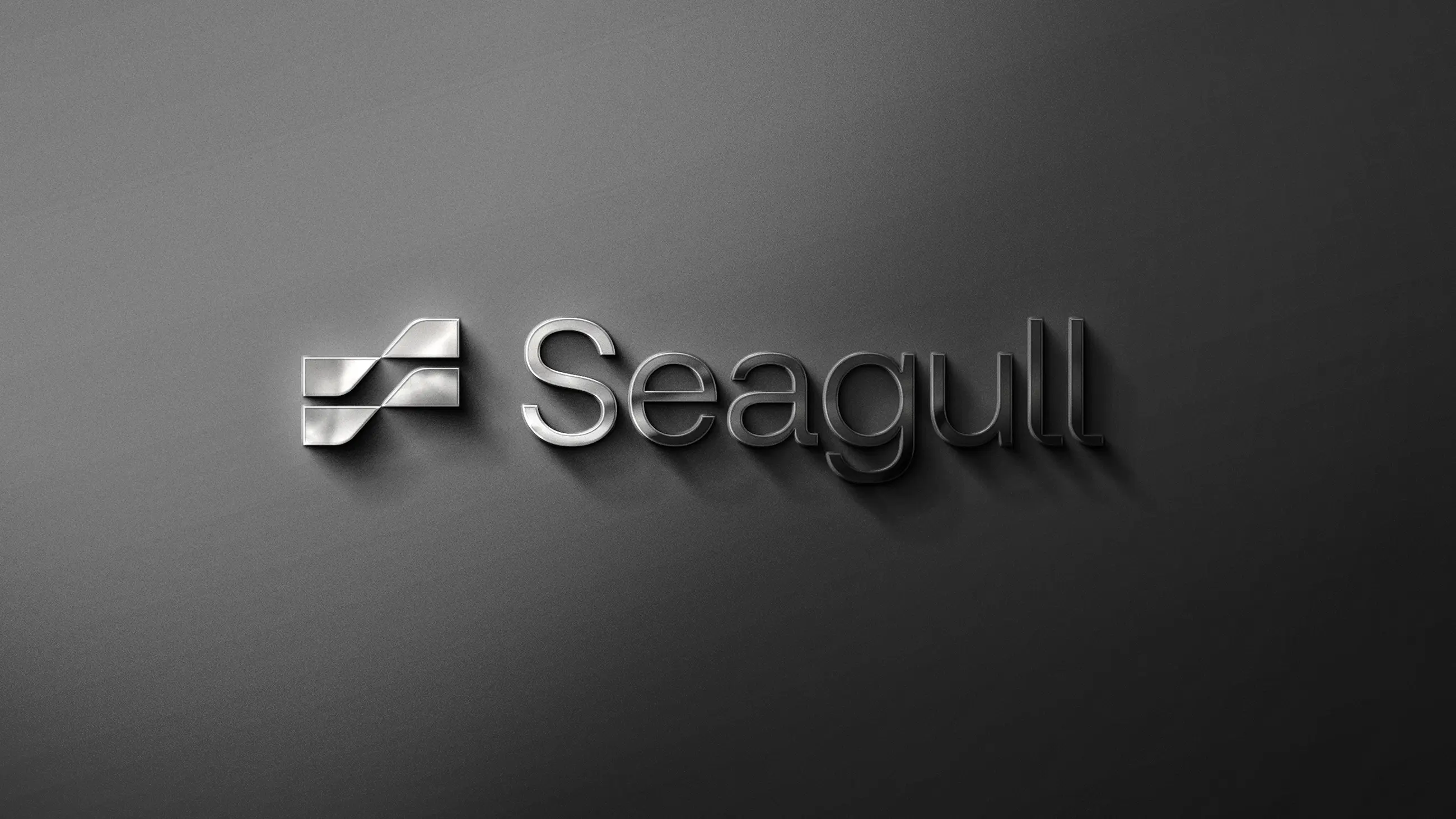
The Seagull brand icon reinforces the nautical nature of the company’s core operations while incorporating an ‘S’ in the negative space, resulting in a unique and memorable logo that is instantly recognisable. This distinctive visual element helps to establish Seagull’s identity in the marketplace and reinforces their commitment to excellence and innovation.


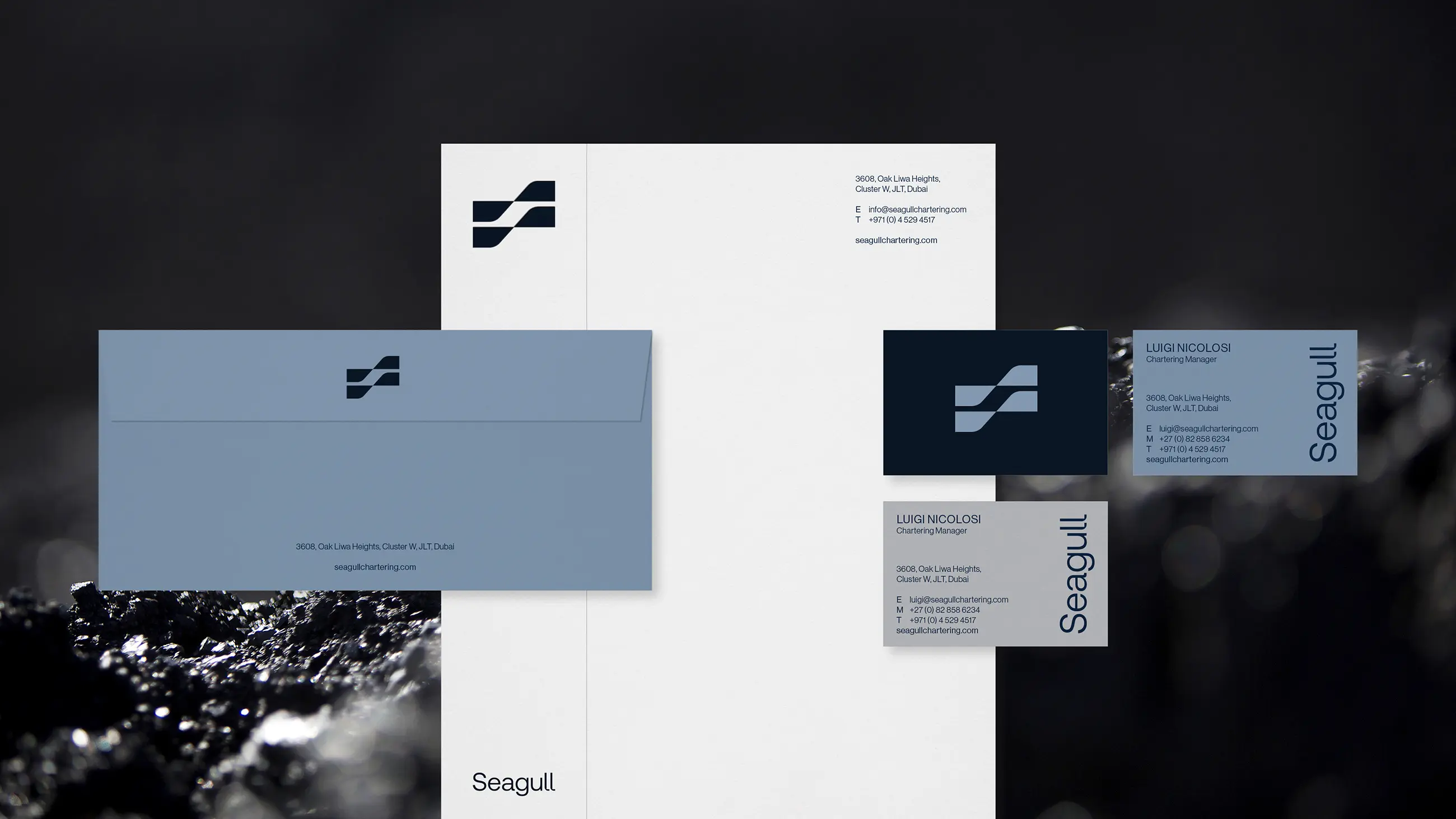
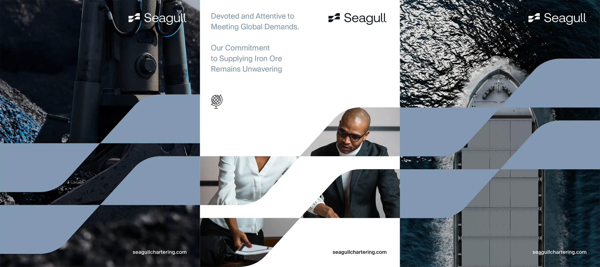
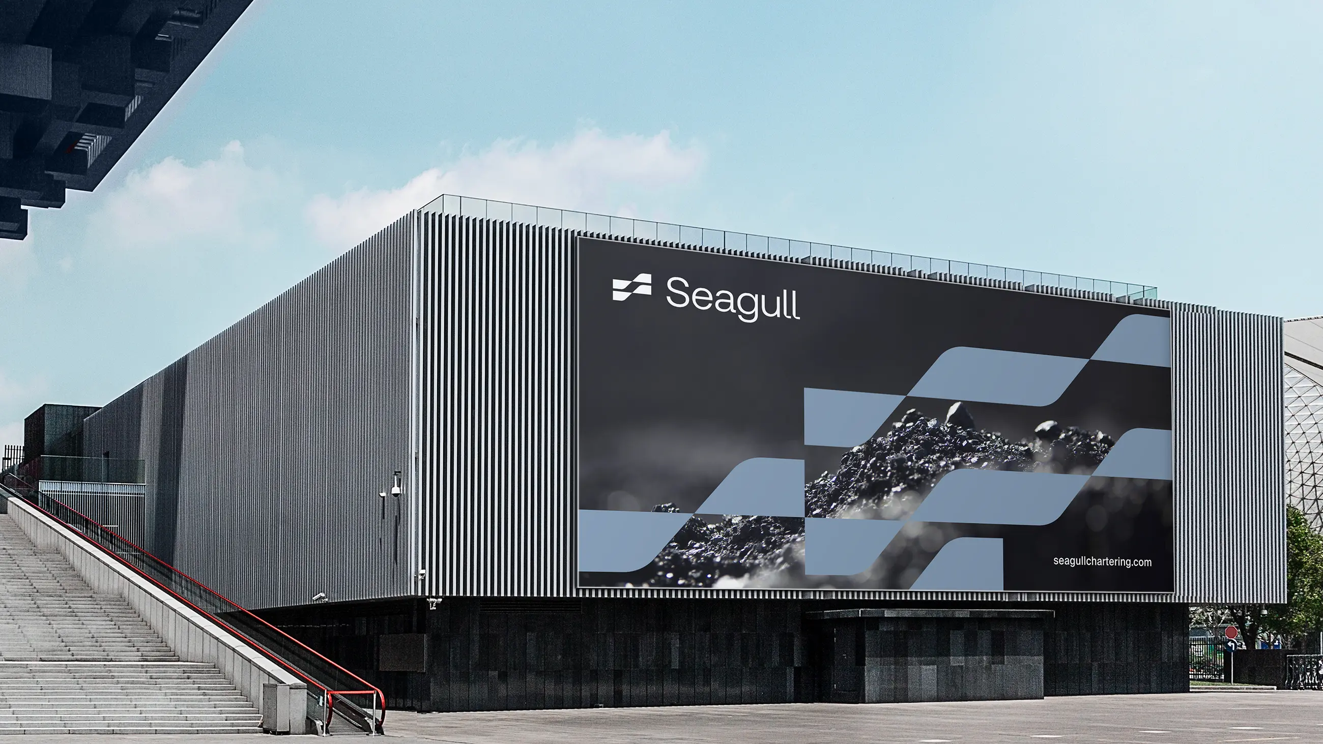
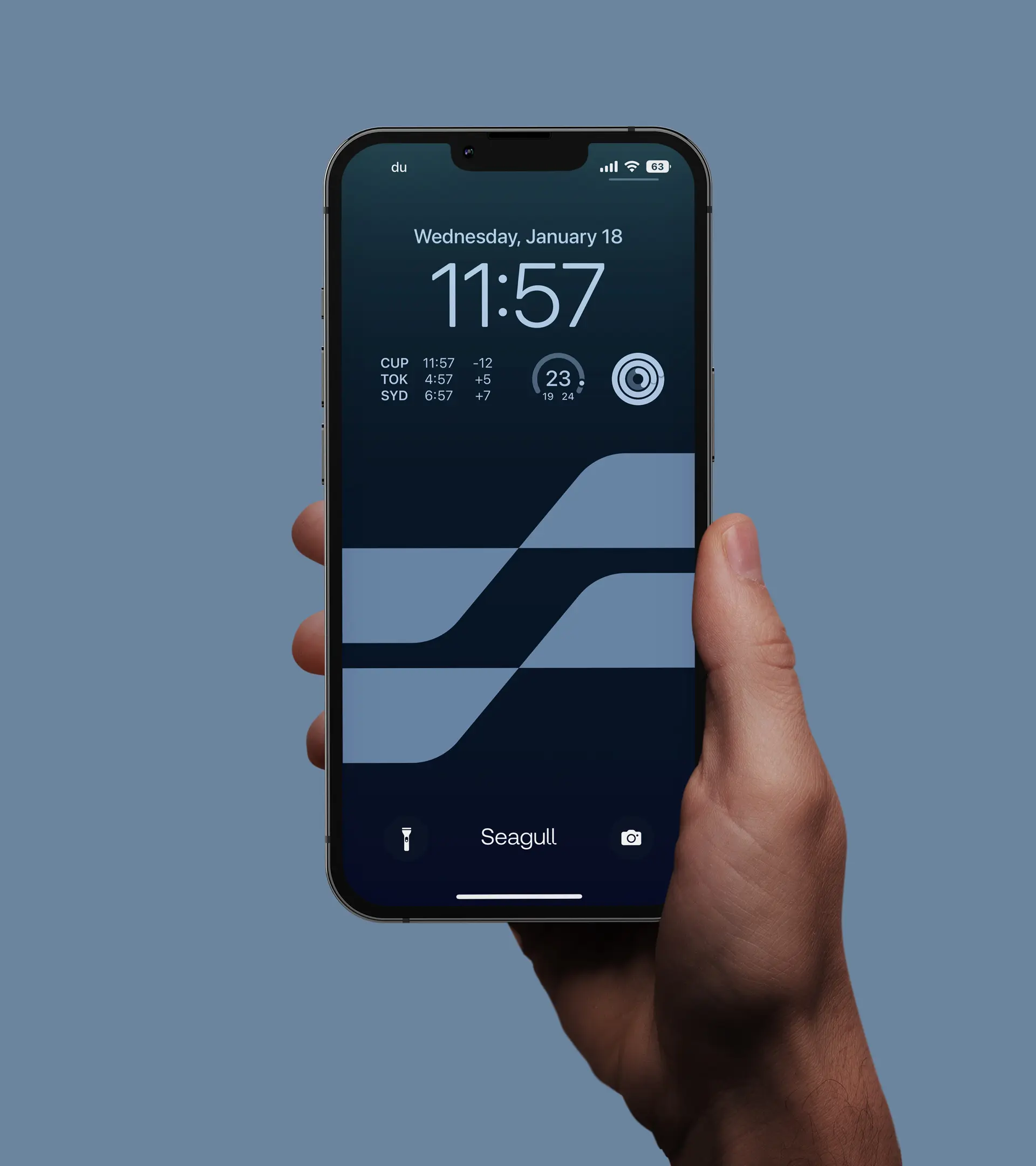
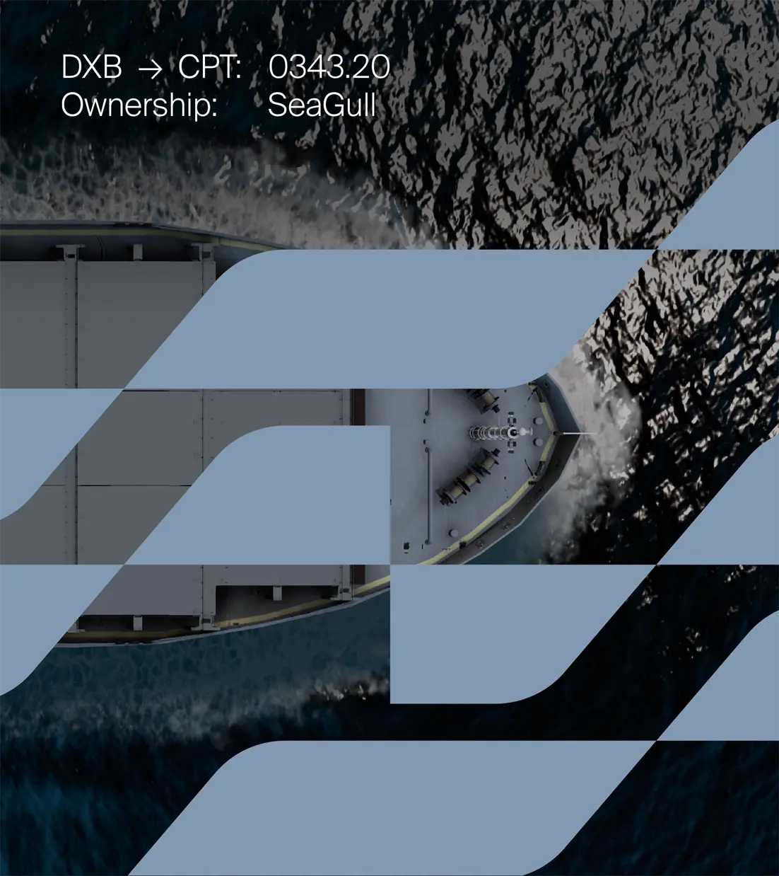
The brand pattern serves to connect buyers with the global supply chain and creates an engaging and consistent look and feel across all communications. By incorporating visual elements that evoke the movement of ships and the flow of materials, the pattern reinforces Seagull’s expertise in the transportation and logistics of iron ore and helps to position the brand as a trusted partner for global buyers seeking reliable and efficient supply chain solutions.
© 2026 B·U·T NV
Ready to define what’s next for your brand, digital product, or service? Let’s talk.
We are part of B·U·T NV, merging technology and creativity for business and industry.