WE ARE PURPLE
WE ARE PURPLE
WE ARE PURPLE
Safa Community School
Safa Community School
Safa Community School
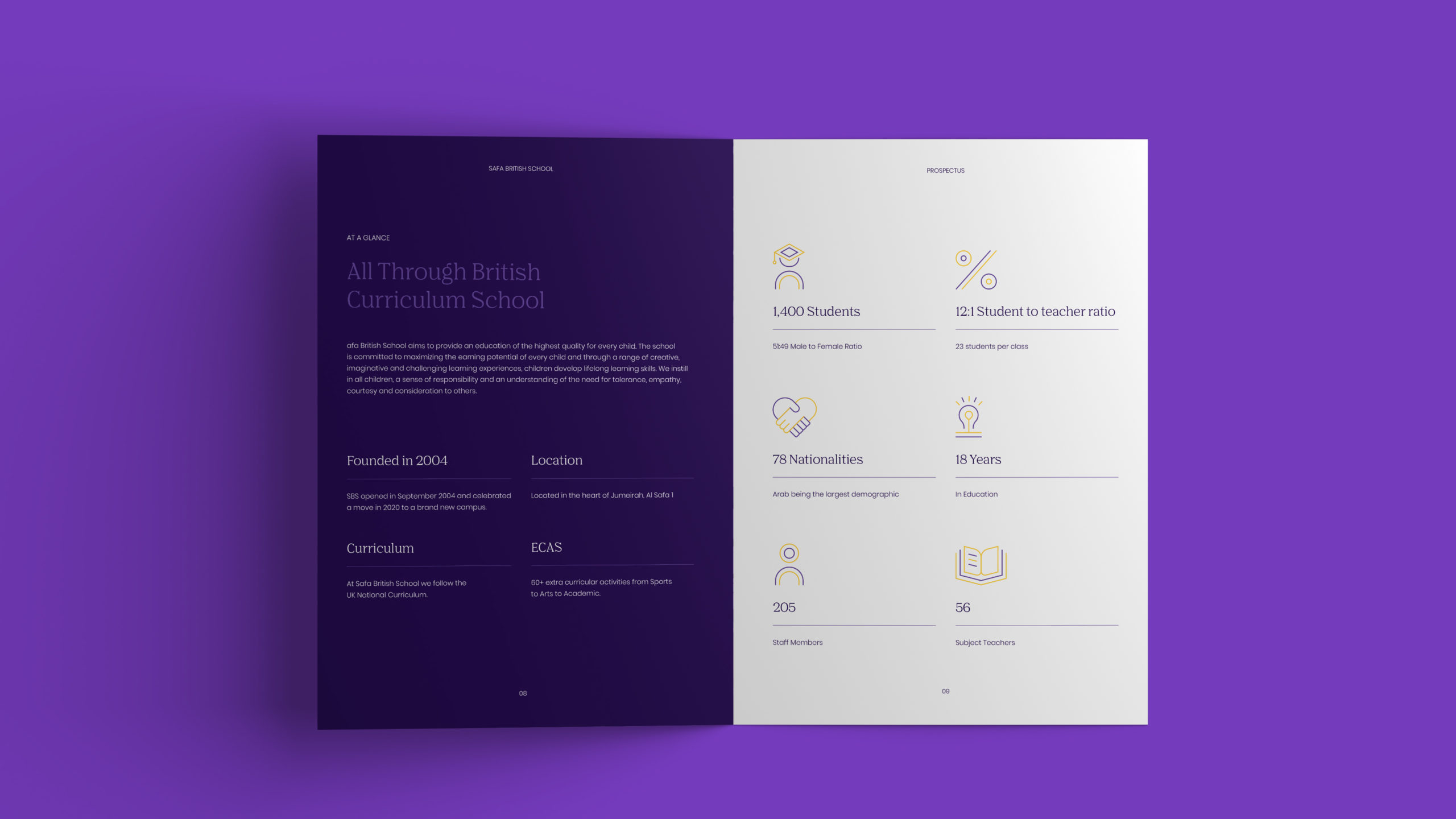
Safa Community School aims to provide an education of the highest quality for every child. The school is committed to maximising the learning potential of every child and through a range of creative, imaginative and challenging learning experiences, children develop lifelong learning skills.
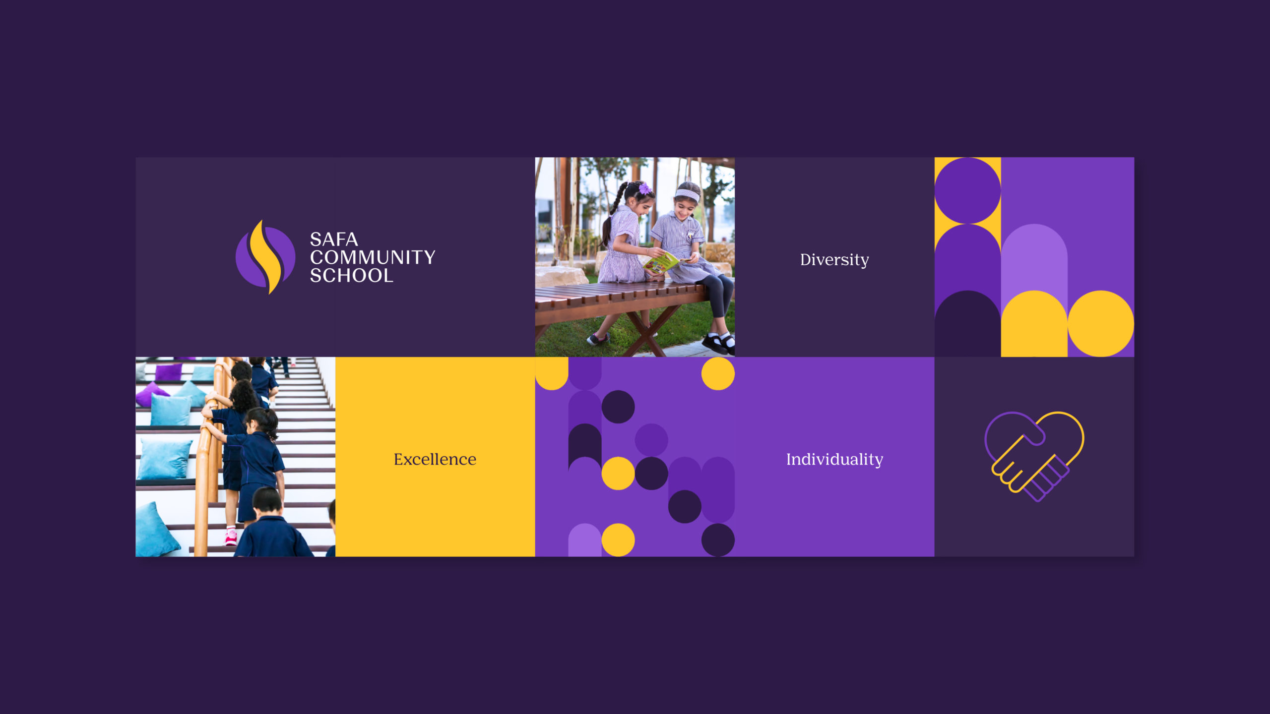
As the school started to grow, the leadership team felt it was time to elevate their current brand identity to align with the future growth of the school. We started with refining their current brand-mark with a more custom and confidant typeface. The iconic Safa flame icon also went through a redesign, enabling it to live both online and offline with a well-crafted balance.
WE PARTNERED IN
Brand-mark, Positioning, Brand Guidelines, Digital, Print
WE PARTNERED IN
Rollout, Visual Language, Guidelines, Print, Marketing, Digital, Social Media
WE PARTNERED IN
Brand-mark, Positioning, Brand Guidelines, Digital, Print
WE PARTNERED IN
Brand-mark, Positioning, Brand Guidelines, Digital, Print


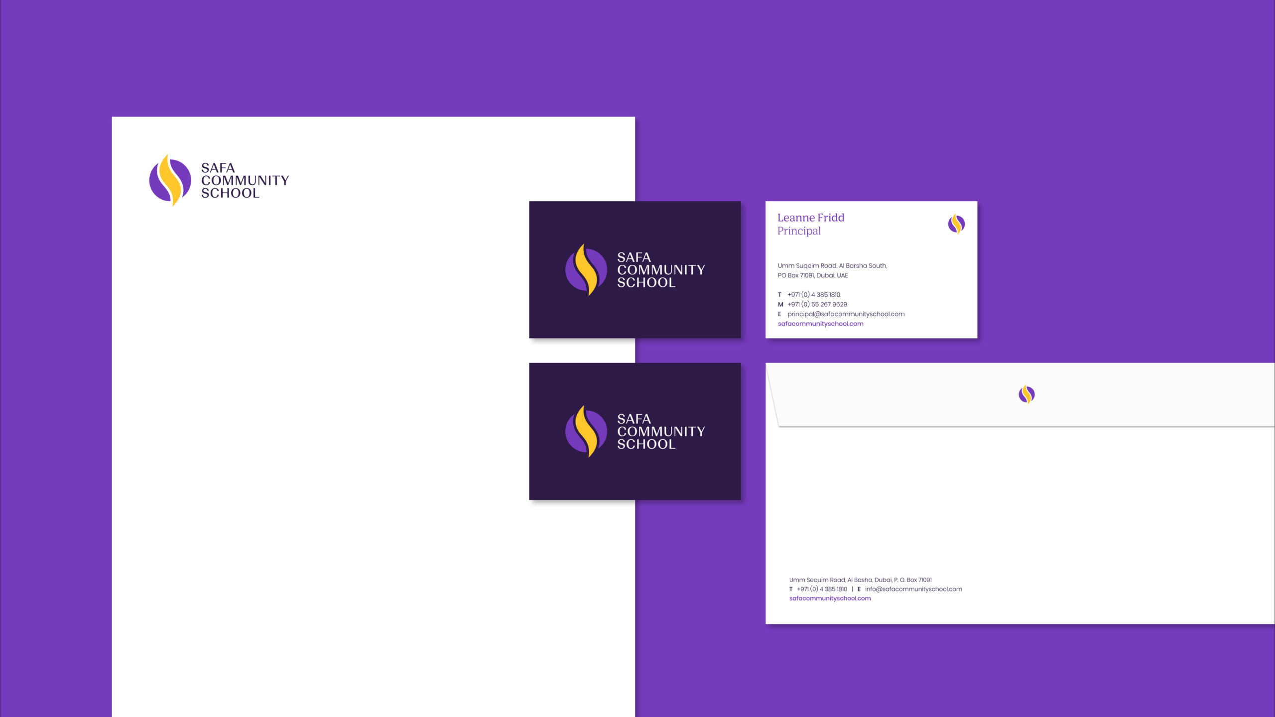
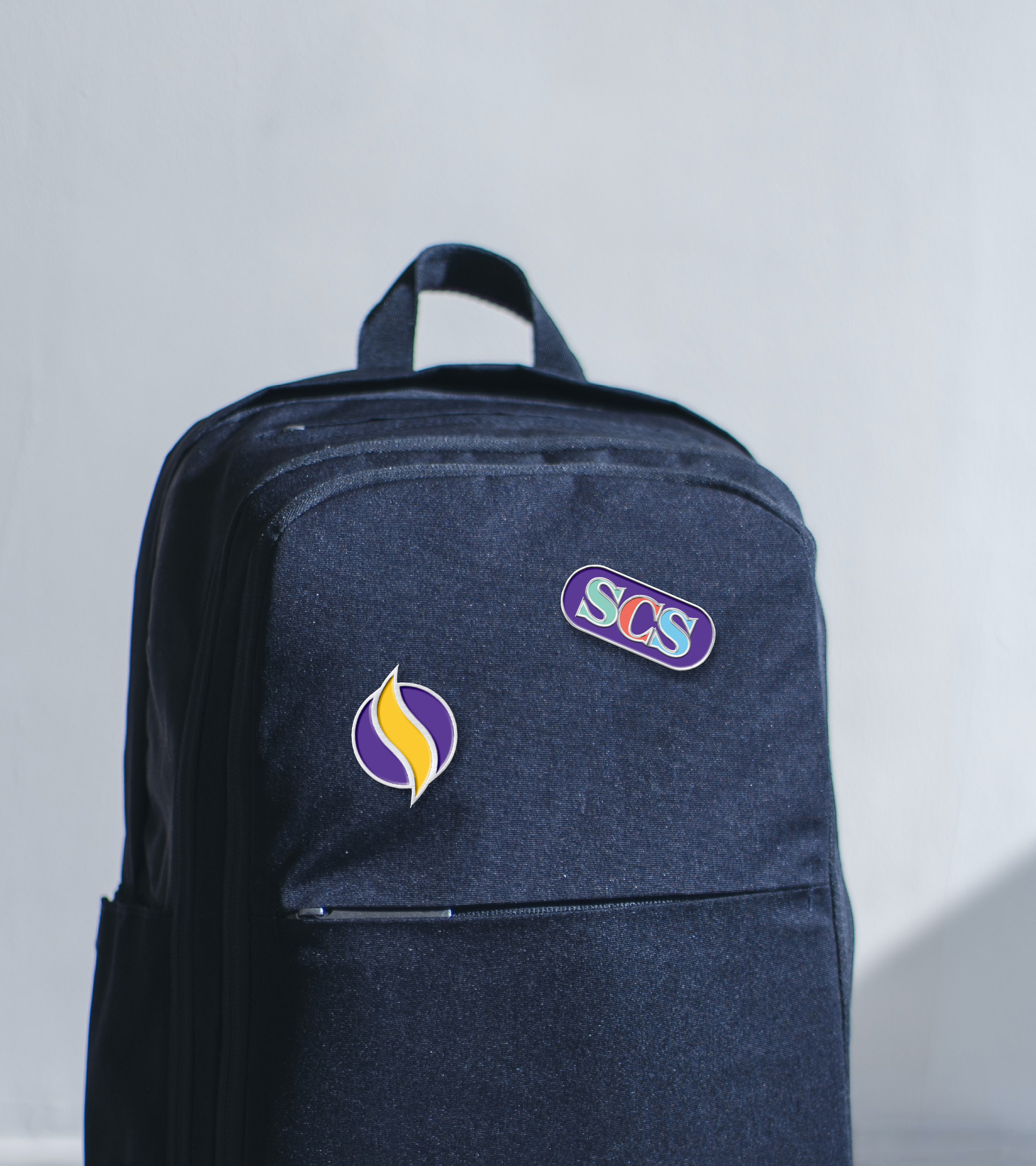
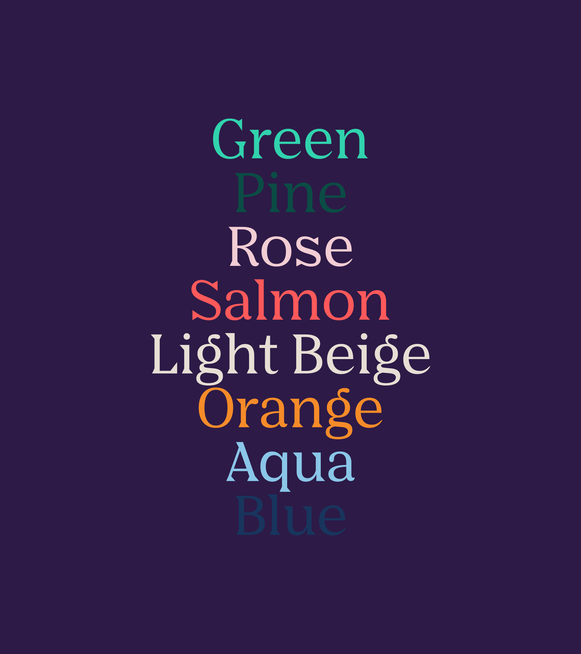
It was important to champion the iconic core colour of purple and make it more recognisable and cohesive across all communications. A refreshed secondary colour palette was introduced to highlight all core values of inclusion, creativity and diversity.
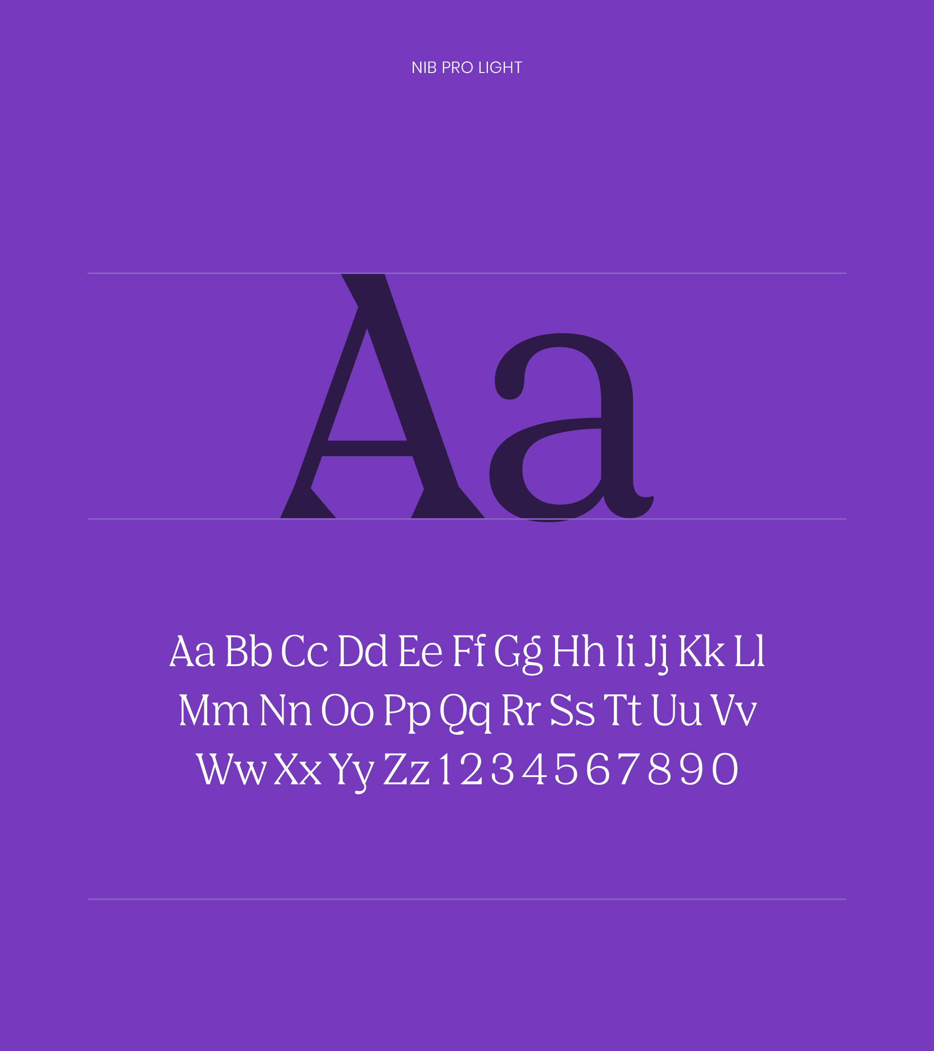
New primary and secondary typefaces helped the rebrand become more approachable whilst maintaining a sense of educational excellence and legacy.
We felt it was important to champion the iconic core colour of purple and make it more recognisable and cohesive across all communications. A refreshed secondary colour palette was introduced to highlight all core values of inclusion, creativity and diversity.
New primary and secondary typefaces helped the rebrand become more approachable whilst maintaining a sense of educational excellence and legacy.


Next Project
Next Project
Next Project
LUSTICA BAY
LUSTICA BAY
LUSTICA BAY
